The Collector's Palette: Using Color Psychology to Choose Art That Elevates Every Room
The decision to acquire a work of art is rarely purely rational. Collectors are moved by composition, by narrative, by the reputation of an artist, by the particular quality of light captured in a brushstroke. Yet one of the most visceral and immediate responses to any artwork—color—is frequently treated as secondary, a matter of personal taste rather than informed intention.
Research in environmental psychology and color theory suggests otherwise. The hues that dominate an artwork exert measurable influence over human emotion, cognitive function, and even physiological response. For collectors who care about how their acquisitions shape daily life, understanding this science is not merely academic—it is practical.
How Color Acts on the Human Mind
Color psychology, as a formal discipline, has roots in the early twentieth century and has been refined through decades of research in clinical, commercial, and residential environments. While individual and cultural responses to color vary, certain patterns are sufficiently consistent to guide collecting decisions with confidence.
Blues and blue-greens—the palette of water and sky—are broadly associated with calm, cognitive clarity, and emotional regulation. Studies conducted in workplace and residential settings consistently find that environments dominated by cool blues encourage focus and reduce reported stress. For collectors, this suggests that artwork anchored in these tones may be particularly well-suited to home offices, reading rooms, or any space intended for sustained concentration.
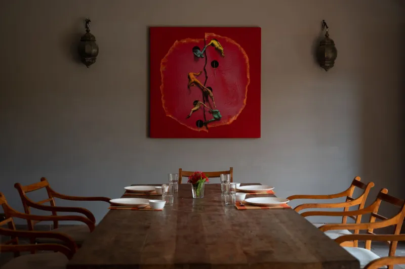
Warmer tones tell a different story. Reds, oranges, and saturated yellows are physiologically activating: they elevate heart rate, stimulate appetite, and encourage social engagement. This is not accidental—these are the colors of fire, of ripe fruit, of physical warmth. A large-format abstract dominated by cadmium red will energize a dining room or a living space designed for gathering in ways that a cool-toned seascape simply cannot.
Green occupies a distinctive middle territory. Associated in psychological literature with balance, restoration, and connection to the natural world, green-dominant artwork performs reliably across a range of domestic environments. Collectors who are uncertain about a space's function—or who simply want a work that endures across different moods and seasons—often find that green-forward pieces offer remarkable adaptability.
Saturation, Value, and the Subtler Variables
Hue alone does not determine a color's psychological impact. Saturation—the intensity or purity of a color—and value—its relative lightness or darkness—modulate the response significantly.
Highly saturated colors, regardless of hue, tend to stimulate and attract attention. They are assertive presences in a room. Desaturated, or muted, versions of the same colors recede and soothe. A collector choosing between two blue canvases—one a brilliant cobalt, the other a dusty slate—is choosing between two fundamentally different emotional registers, even if the underlying hue is nominally the same.
Value operates similarly. Dark, low-key paintings create intimacy and gravitas; they draw the viewer inward. High-key, luminous works open a space visually and psychologically. In a room that already feels enclosed or heavy, a pale, luminous abstraction can function almost architecturally, expanding the perceived scale of the environment.
Practical Guidance for Collectors at Every Level
The principles above are most useful when applied to specific collecting scenarios. Consider the following frameworks.
Assess the room before the artwork. Before acquiring a piece based on its merits in a gallery setting, examine the space where it will live. What is the existing color temperature of the walls, furnishings, and flooring? What natural light does the room receive, and at what times of day? A painting that reads as warm and golden under the neutral lighting of a gallery may shift dramatically in a north-facing room with cool, indirect light. Whenever possible, request a loan or trial placement before committing to an acquisition.
Consider function alongside aesthetics. The purpose of a room should inform the emotional register of the artwork within it. A bedroom is a space of rest and recovery; artwork that is visually demanding or emotionally provocative may undermine its function. A kitchen or dining area, by contrast, benefits from the warmth and vitality that bolder color choices provide.
Resist the impulse toward safe neutrality. Many collectors default to achromatic or near-neutral works—grays, blacks, whites, muted taupes—in an effort to avoid clashing with existing interiors. While such works have genuine merit, they frequently fail to deliver the transformative potential that color-forward art can achieve. A room unified around a carefully chosen chromatic anchor—a painting with a specific dominant hue that is then echoed, in smaller doses, in textiles or accessories—achieves a coherence and vitality that neutral-on-neutral environments rarely attain.
Build a collection with chromatic intentionality. Collectors who acquire works over time benefit from thinking about their collection's overall color ecology. A private collection that spans deep indigos, warm terracottas, and soft sage greens can be curated and rotated through domestic spaces seasonally, allowing the emotional character of a room to shift in ways that mirror the natural world's rhythms.
Color in the Gallery: Learning to See Differently
Visiting galleries with color psychology in mind changes the experience of looking. Rather than responding solely to subject matter or formal composition, the attuned collector begins to notice the emotional temperature of a work—the way a particular combination of warm and cool tones creates visual tension, or the way a monochromatic field of deep violet produces a quality of interior quiet that is almost meditative.
At Artag Gallery, curated collections are assembled with attention to precisely these qualities. Whether a collector is drawn to the kinetic energy of color-field abstraction, the restrained elegance of tonal still life, or the vivid expressionism of contemporary figurative work, understanding the psychological dimension of color transforms acquisition from a matter of taste into an act of genuine intention.
The art that moves us most is rarely the art we chose passively. It is the art we chose with knowledge—of ourselves, of our spaces, and of the extraordinary power that color exerts over the lives we build around it.